Get That Vintage Look With Inoreader’s Sepia Theme

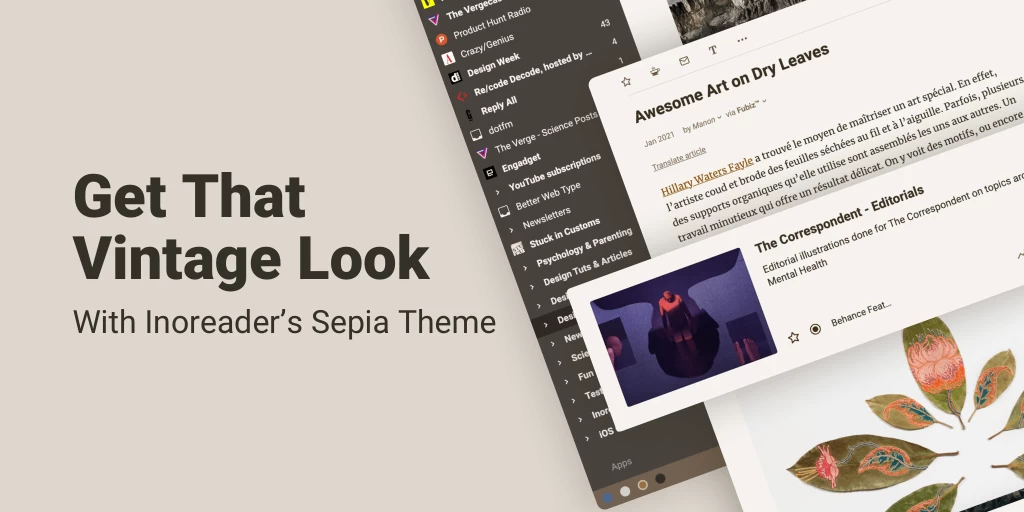
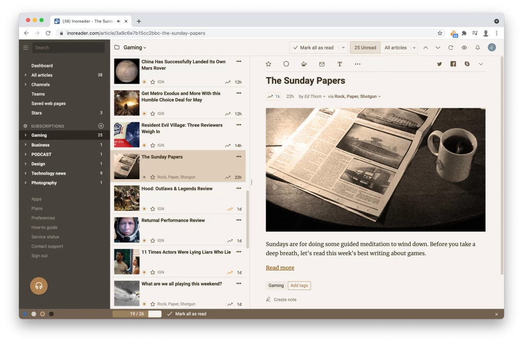
We just expanded Inoreader’s list of themes! By popular demand, we are now adding a Sepia theme for our web application. It gives your Inoreader a nice vintage look while being easier on the eyes than the other themes. Here is a quick preview:

We’ve carefully crafted the Sepia theme to have slightly lower contrast to reduce eye strain without compromising readability a bit. We chose to stick with a dark sidebar because it better separates catalog from content and to keep a more consistent look with our default Aqua theme.
You can switch themes from the Profile menu at the top right corner or get a quick access from the footer. We listen and respond to every bit of feedback, so if you spot any issues or have a suggestion, just use the “Contact support” form.
We hope this addition to themes will make your reading experience even better!


