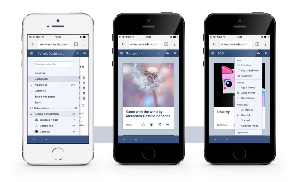
Up to now the mobile web version of Inoreader gave you the crucial functionality you might need on the go. Today we’re launching the new Inoreader web version for mobile phones – a much richer and better looking successor of our old mobile web version. Now you have the full Inoreader platform with all the content and functionality straight in your pocket. Jump and go give it a try – all you have to do is open inoreader.com on your phone’s browser.
And here’s what’s new:
All Inoreader functionality on the go
The most significant change we’re proud of is the inclusion of all Inoreader functions to the mobile version. You can now take full control of your content, manage folders and tags, create rules… actually, there’s no point for me to list every feature you have access to – chances are if you’re using it, you can now use it on mobile, too.
Slicker and more user-friendly design
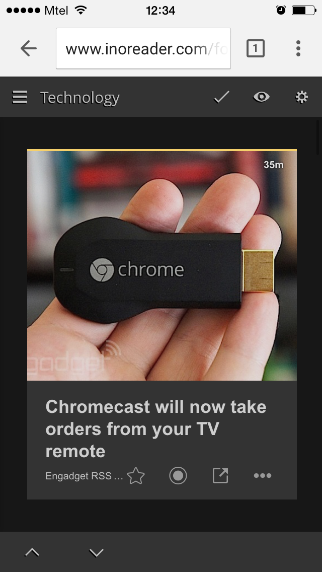
In any case, design wasn’t the strong point of our old mobile browser version – but now you’ll note that mobile uses a design much more similar to the desktop version, all the way down to changing themes. This will make switching between desktop and mobile seamless and will ensure that you’re getting the reader you’re used to on any device.
Direct access with menus
The extensive amount of options gives great flexibility to Inoreader, but it can also make for a really cumbersome navigation on mobile. We tried to negate this effect by consolidating options and putting them on the most accessible places we could think of.
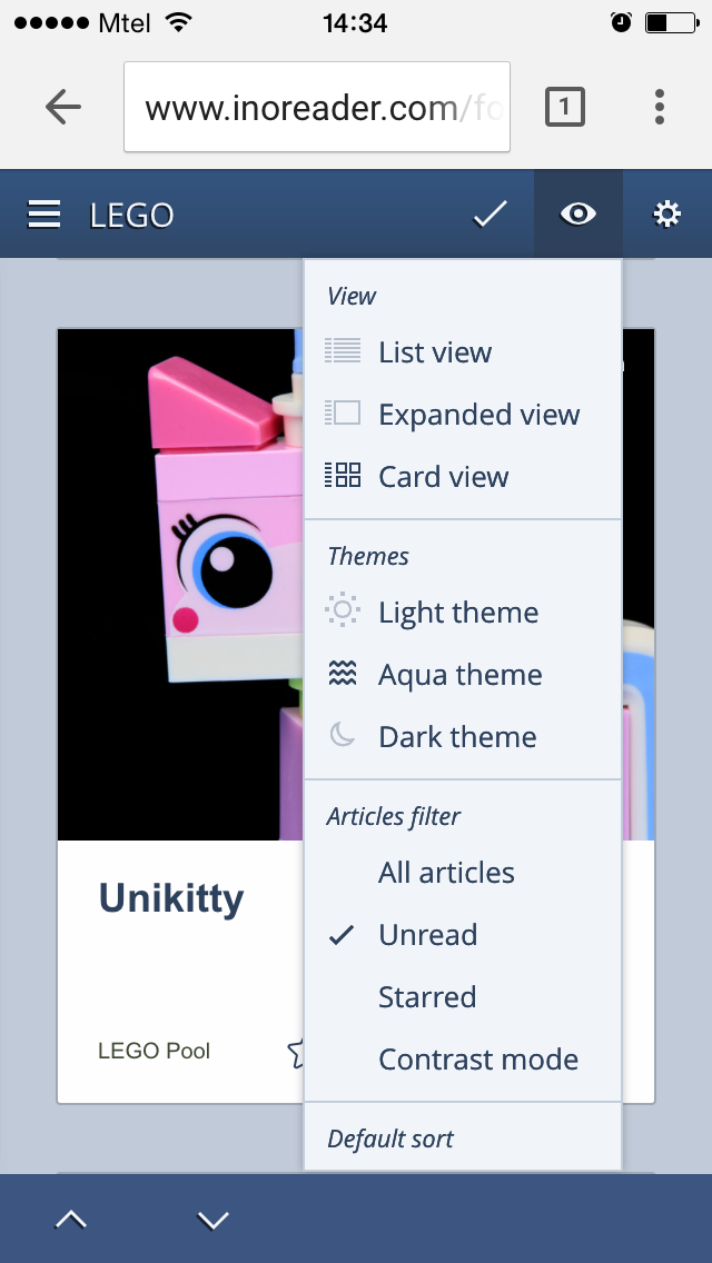
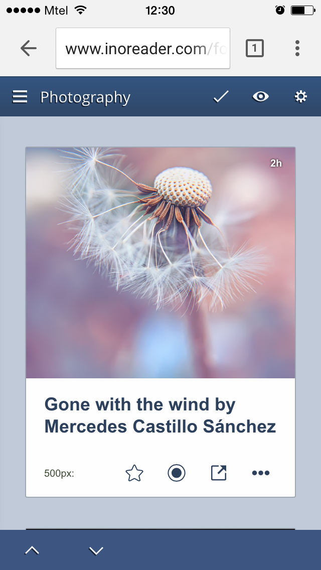
The eye menu will give you access to the design and reading layout settings. Here you can change the view, theme or sort order of your articles. Any changes you make to the views of feeds and folders will be kept on the desktop version, and vice versa.
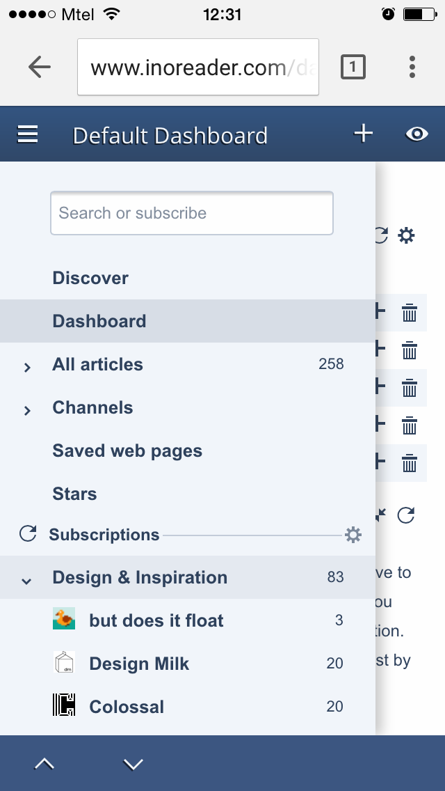
You’ll also see a new footer menu for navigating between feeds and articles and closing expanded articles – it made a lot of sense to include those here, closer to your thumb for easy use.
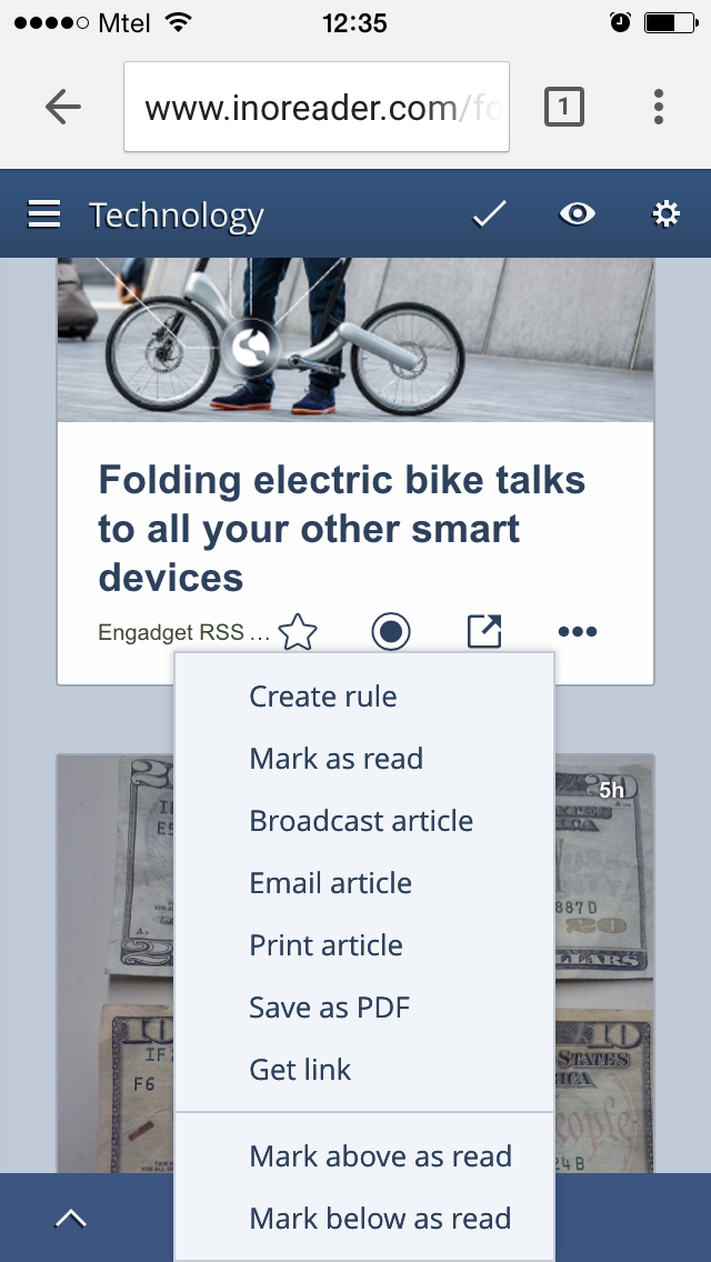
The article menu lets you share articles, mark as read and create rules. You can also access all social sharing options at the bottom of each article.
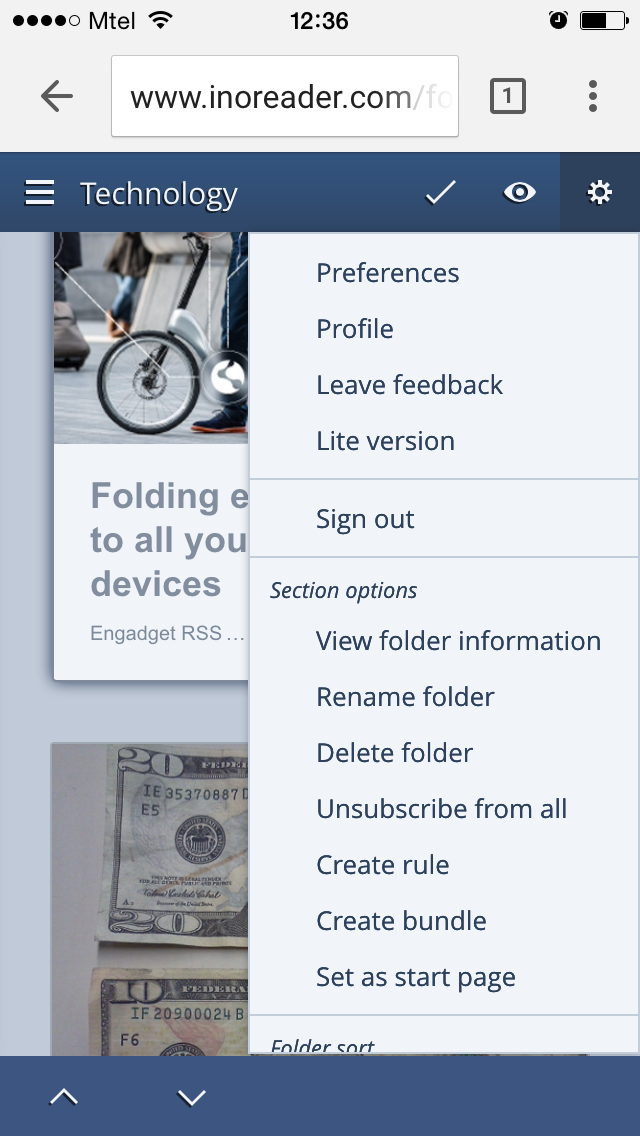
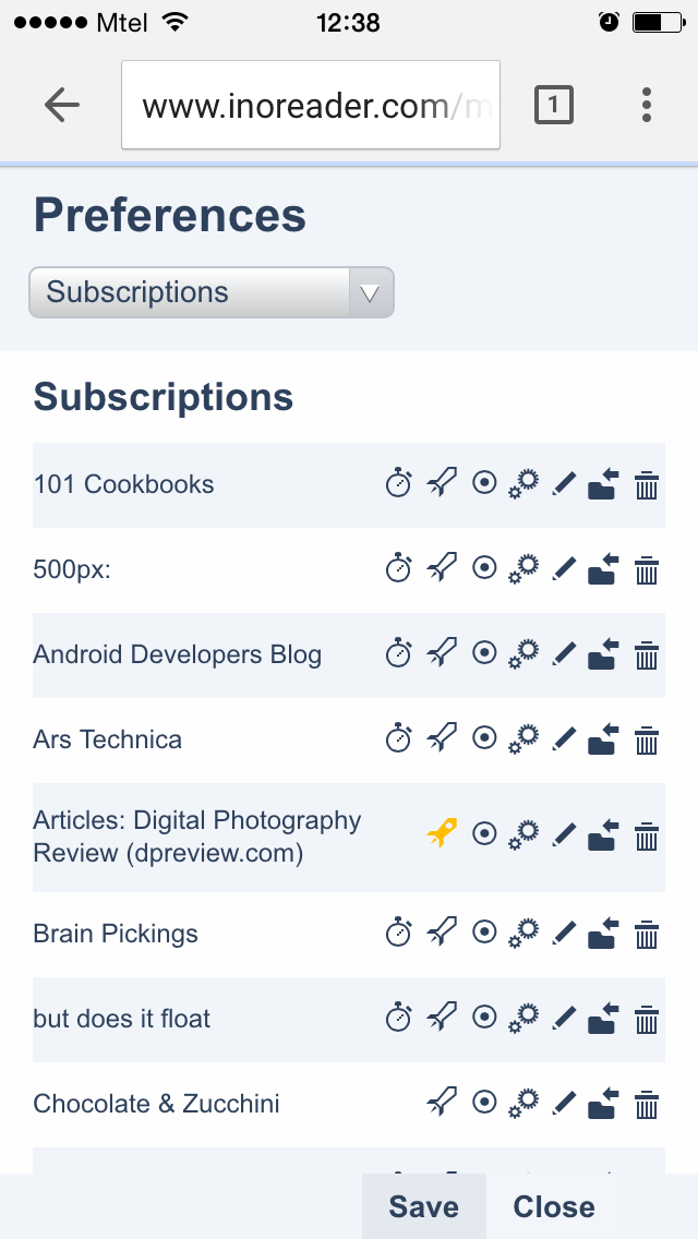
The gear menu shows the options you’re used to on desktop, but also includes the section options and feed settings. This menu is customized based on the specific section you’re in and will show you only the options relevant to it. Here you also have access to the full Preferences panel.
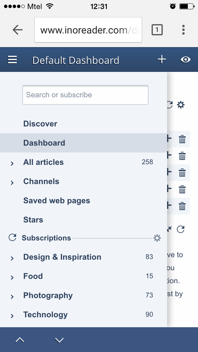
You also have direct access to the tree pane from the top left-hand corner. Here you have all the navigation options you’re used to on your desktop.
Mobile-friendly article views
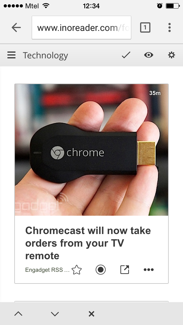
Of course, it doesn’t really matter how many options the mobile web version has, if you can’t consume content in a convenient manner. This is why we spent a lot of effort on adapting the mobile-friendly article views. You now have three options – card view, list view and expanded view. If you use column view in the web interface, content will be displayed in list view on the mobile browser.
Mobile dashboards
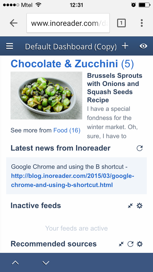
If you’re used to starting your Inoreader experience from your dashboard, you can now do that on mobile, too. You can even change your dashboard on the go – just tap the plus button to add gadgets or the gear icons of each section to update it.
Do you like the new mobile version? Drop us a line in the comments. If you prefer the old mobile platform, you can still access it. Pop the gear menu and select the Lite version at any time or just bookmark
www.inoreader.com/m for direct access.
