Inoreader v13 is Here With Improved Looks and New Features!

Since the beginning, Inoreader was meant to be a power-user tool, pushing the boundaries of what RSS readers can do. We were the first to introduce automation with integrated Rules, then go beyond RSS Facebook pages feeds, even native support for microblog posts. If you are regular to our blog, you will know that we never stopped adding new features.
This doesn’t come without a price tag! Adding features ad-hoc means that sometimes we lose coherence in the user interface. Not everything is intuitive, there are too many buttons, switches, options and redundant information on the same screen. Some people get used to it, but it doesn’t mean it’s right. We knew for quite a while, that something has to be done.
Today we are releasing our brand UI redesign, which aims to bring this missing coherence in the user interface and generally make Inoreader a more pleasant place for everyone. It’s the result of months of prototyping, user testing and even a full-blown interim version using a completely different frontend framework. There are also brand new features, that we will cover in greater detail in subsequent posts.
Let’s have a quick walkthrough with the most important changes.
The first thing you will probably notice is the new typography and article layout:
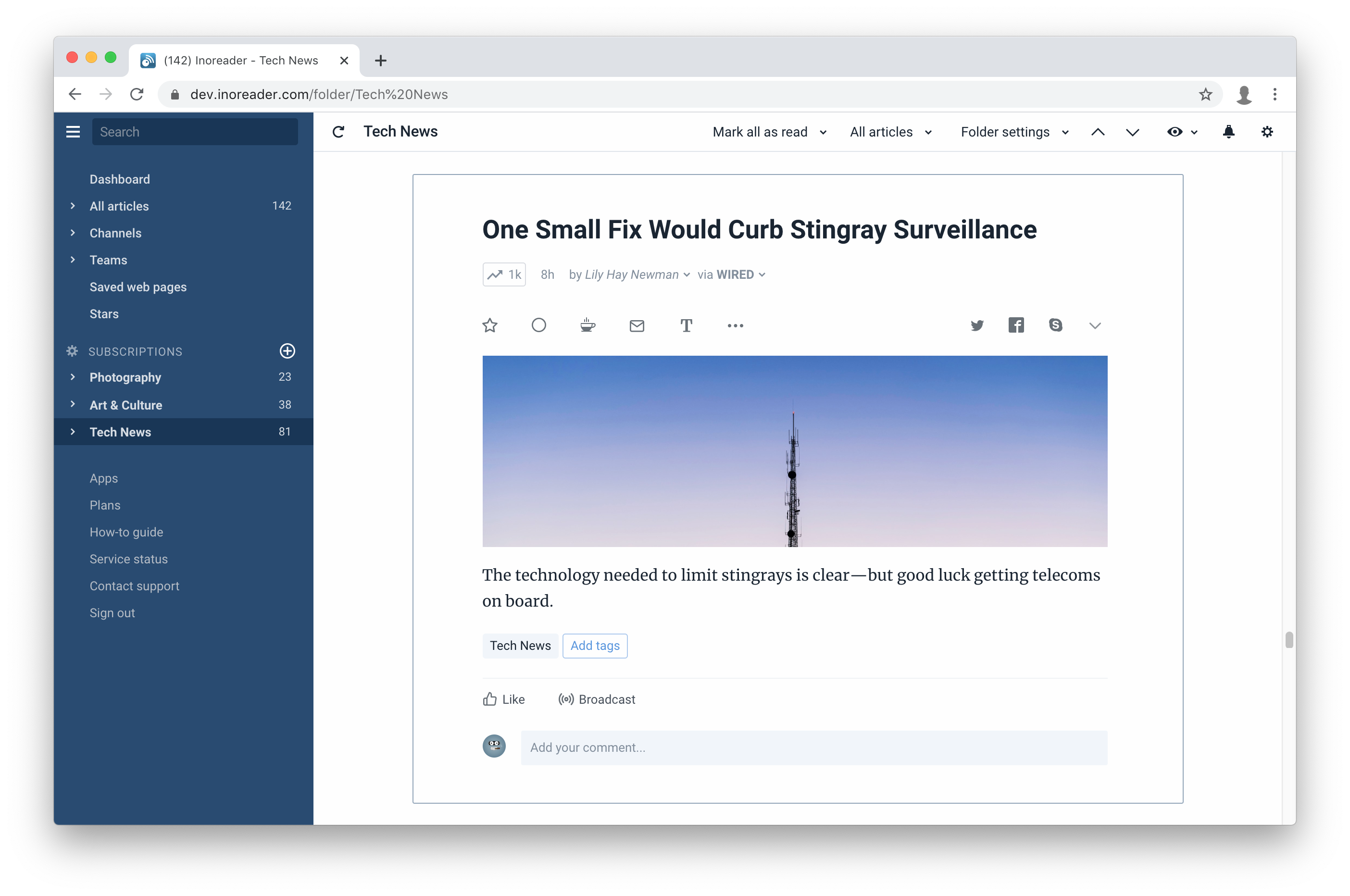
By default articles are centered, but if you prefer the old left-aligned article or even full-width articles, you can easily change it back from the new text preferences bar:
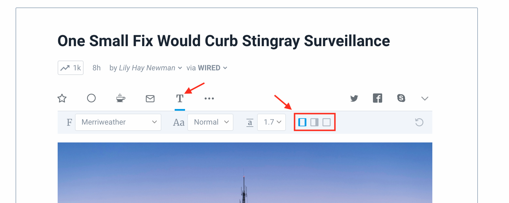
That’s where you will also find the font size and other settings, as they are no longer buried deep in the preferences. Speaking of the article toolbar, it will now float as you scroll past longer articles, so you don’t have to go all the way to top or bottom just to add a star to the article.
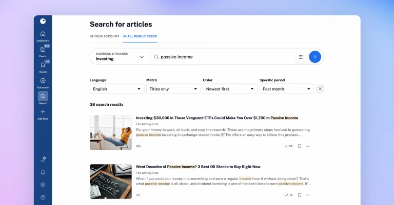
The search functionality has been reworked from scratch. Since Inoreader allows you to search for all kinds of stuff, it’s hard to have a one-box-fits-all solution, but we think we made things a lot more intuitive this time:
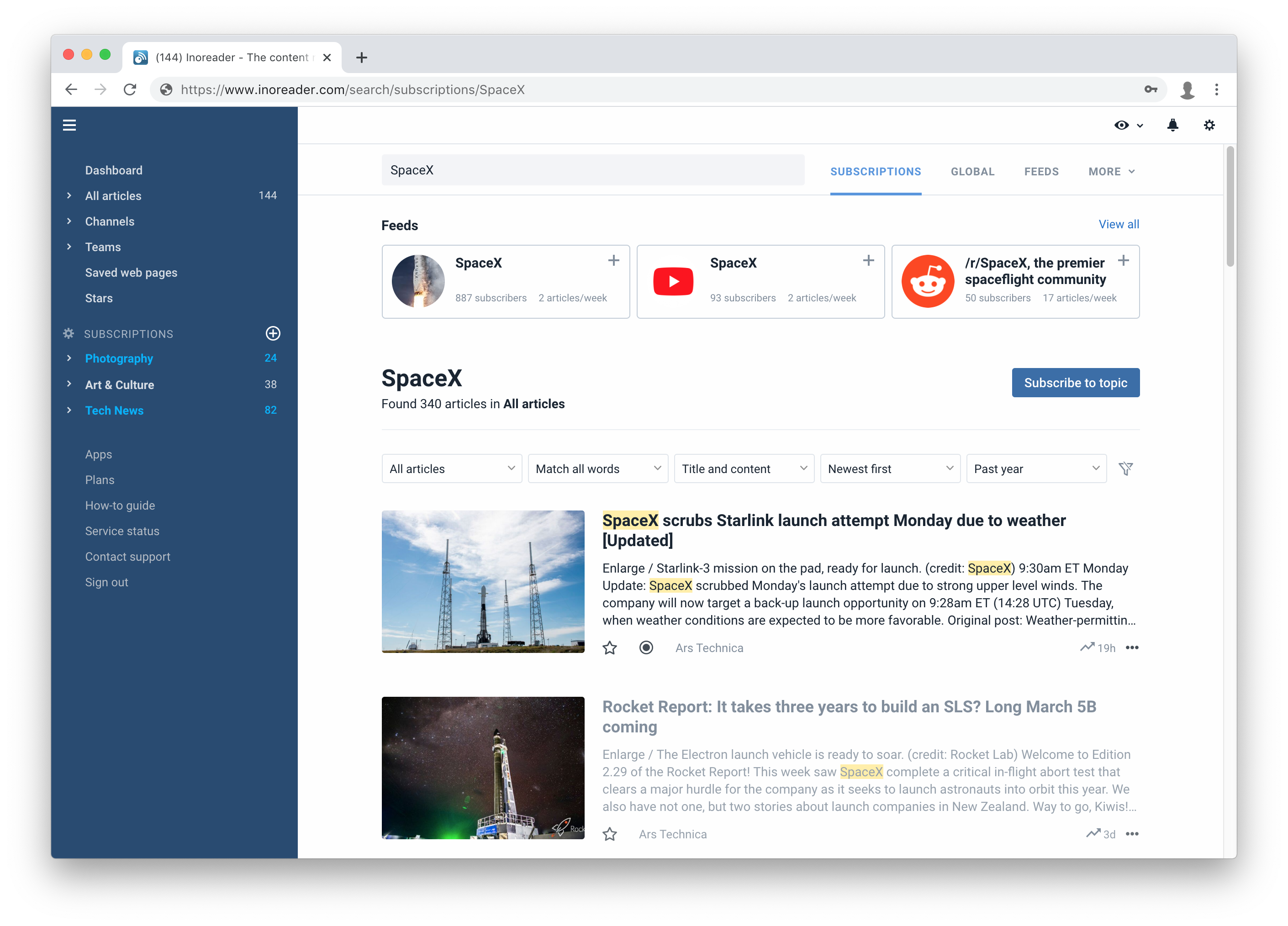
The new catalog (which is seamlessly integrated with the search functionality) will help you find new and interesting feeds to subscribe to, with more than 50 categories with cherry-picked sources. We will continue to add more sources in the future too.

Because Inoreader is full of customization options and features, the preferences are a common place to visit, unlike most software where you only go there to change your password for example. That’s why we took great care to rearrange them and make everything intuitive and pleasant to use.
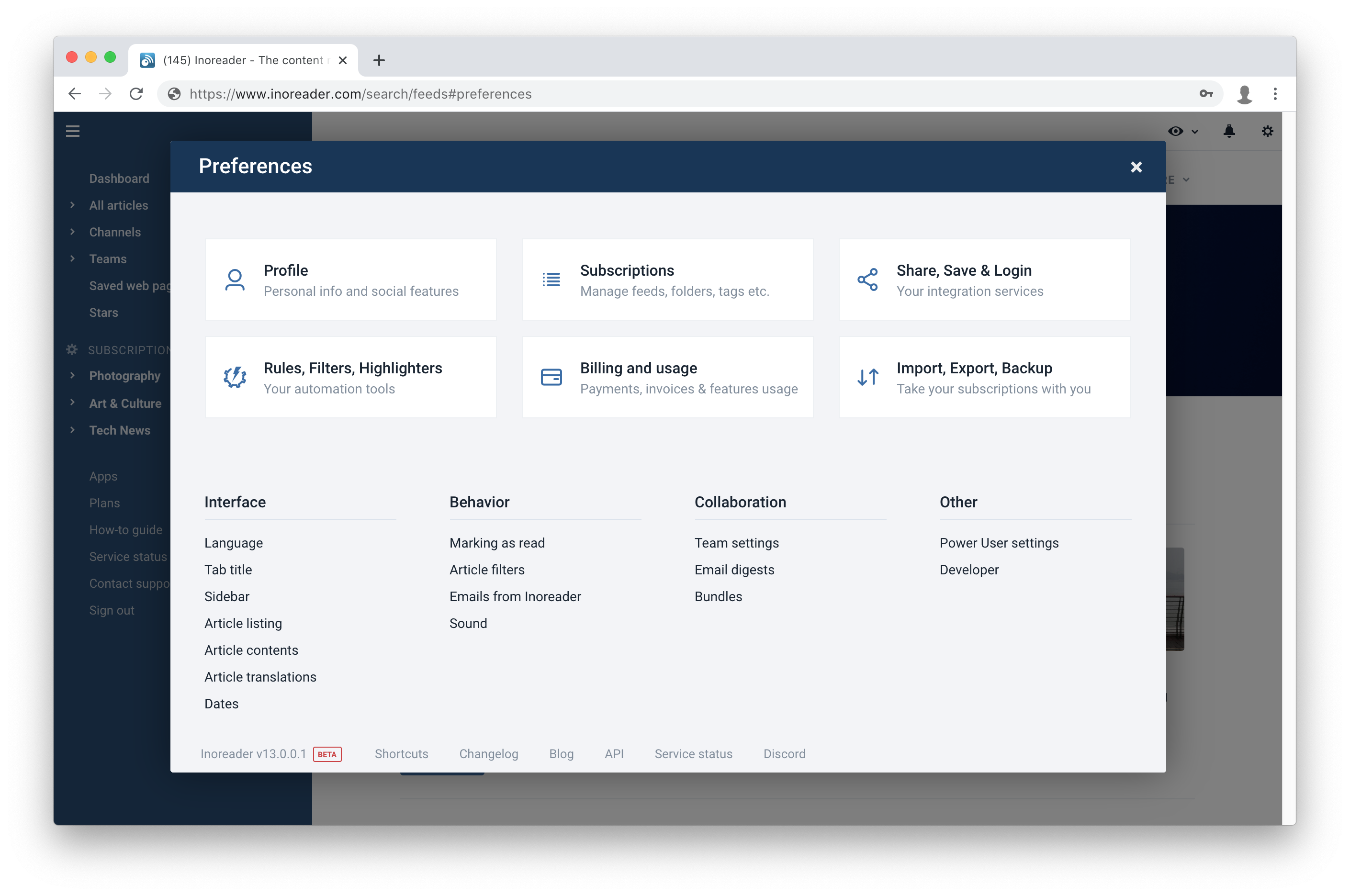
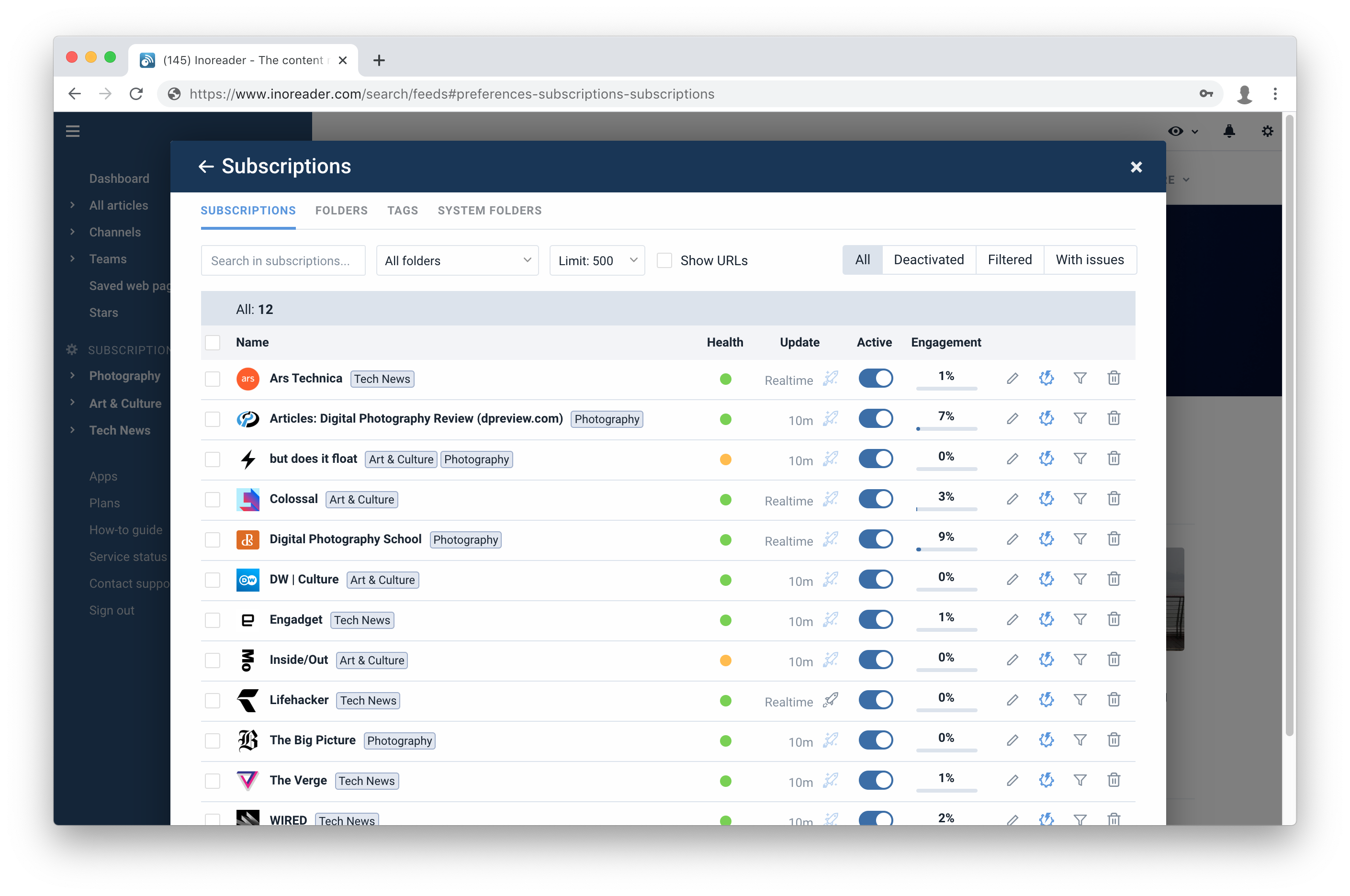
For example, one of the most important modules is the Subscription manager. It’s now not only improved visually but also shows an “Engagement” column, showing how much you read stuff from this source.
Filters can now be browsed, renamed and even temporarily disabled, highlighters too. There is also a brand new section called “Power User settings”. From there you can enhance Inoreader even more by removing some features or elements that you don’t use. And if that isn’t enough for you, we have also added an option to use your custom CSS!
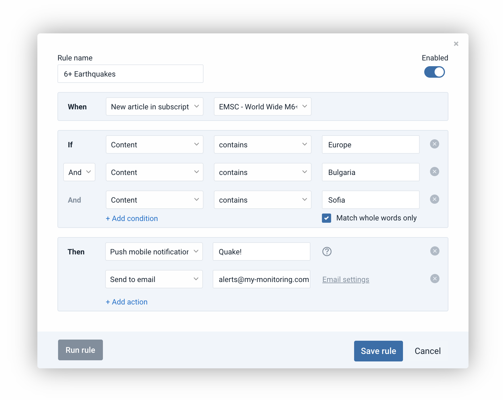
Fans of rules will be pleased to see our improved rule dialog. We have greatly simplified the layout of the dialog, Performance has also been dramatically improved, so you can add hundreds of conditions without any slowdowns.
New features!
But wait, we are not only serving UI refreshments today. There’s desert too!
Email newsletters – Inoreader now allows you to create custom inboxes that work just like regular subscriptions, but instead of RSS items, they feed from emails! You can now forward all your newsletters to Inoreader and read them together with your regular feeds, apply rules, group newsletters into folders, all the good stuff that you can do with regular feeds.
You can read more about this feature in our dedicated blog post.
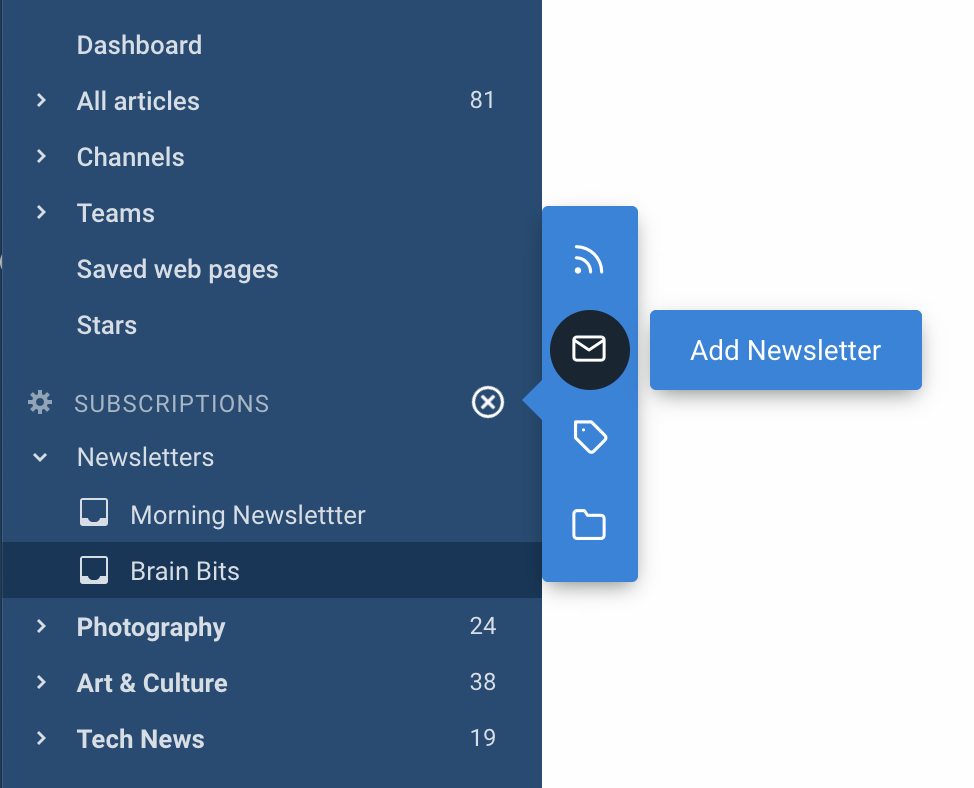
Email digests – You can now set up a daily, weekly or custom email digest from articles collected in a tag, team or any other section. You can subscribe external recipients like your management for example to receive those digests.
You can read more about this feature in our dedicated blog post.

There are a lot more subtle changes to the user interface of Inoreader, optimizations of the code, so it is as snappy as before and even faster here and there. We also have a completely redesigned login page and finally, publicly visible pricing.
As always if you spot any bugs and issues, use our contact form, as this is the best method to get official support.
We would also like to invite you to our new Discord server where we casually chat about new features, experiments or just geek about RSS:


